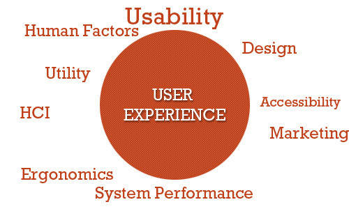
Websites should give the users a good experience. They should:
- Be easy to navigate through
- Have a visible menu bar
- Have a good font choice and size
- Have content that is easy to read.
- Have colors that blend with each other.
- Not have too many colors that make it look unprofessional
- Be straight to the point and pass the intended message
- Not have images everywhere that block the main idea of the website.
- Have reasonable slideshows.
- Qualify for all the requirements of a website
1) The design should be user-friendly
People easily get irritated when they get to a website and can’t really figure out the way forward. This can easily make them leave the site irritated and not want to come back to it again. In the recent past, people would easily tolerate not knowing how to navigate through the website because most users were not that knowledgeable. However, nowadays, users are educated digitally wise and thus can’t tolerate it.
Use a simple design with visible content and a menu. When a visitor comes to a website, he or she wants to get the information very fast and not think about where to find it. Images should be properly placed and not be overused.
2) Know your target audience
Different audiences may prefer certain types of designs and can easily understand what is being displayed. While others may prefer certain types of designs that are a bit complex. However, there should be a balance between those who are completely tech-literate and those that aren’t. This will ensure that no one is left out on everything.
3) Do research
Doing research helps you to know what many people prefer. Get to know the current trends, what is being embraced, and what is getting outdated. If you get clients, try to get feedback from them. This will help you know what they hate or like about your website. In certain forums, you can also get views from other people in your niche. In this way, you will know how to perfect the user experience with your website.
Thorough research should also be done, to know what your competitors are doing. Get to know past mistakes and try to improve on them.
4) The website should satisfy the user’s expectations
There are different websites and apps of different natures. If a website is talking about dogs, when a user comes to the website, he or she expects to get some basics about dogs and not get just an overview. The user may end up searching for more content on the website about dogs, yet there isn’t any other. This will easily disappoint the user who has not found what the search engines portrayed the website had. Ensure you give the intended information and not just beat around the bush.
5 ) Make the website simple and consistent
Users prefer straightforward websites. A website shouldn’t have everything; it should only have the necessary stuff. The stuff that should be there should add value to the app or site and not be there for decoration. Make it simple and professional. The website or app should speak for itself; by the way, you have aligned things here and there. Having titles and subtitles on the pages normally act as a guide. Ensure the website also has Call-to-Action buttons that help the user to know what’s next.
6 ) Color, Images, Fonts
The colors used should blend well and shouldn’t be a combination of all rainbow colors. Images make a site look lively, but they should be used wisely to prevent them from diverting the concentration of the user. The fonts used are also crucial, italics to some extent are hard to read, capitalized content makes it seem like shouting and too much use of bold text reduces the readability capacity.
Note: For images, try not to use stock images that have a stamp. Use images that are unique and appealing to the site. Be realistic.
7) Have a goal for each web page
Every web page should have a different subject from the other. This will prevent it from seeming like a repetition of what is already there. People like getting fresh content and not outdated, so make sure you update content once in a while (especially a blog).
8) The contact details should be visible
Make sure the phone number, email address, or address number are easily visible. They should be placed on top of the page where everyone can see. However, it is also advisable to have the contact details at the bottom of the page.
9 ) Make sure there is enough content above the fold.
When a visitor comes to a website, he or she would want to see what the website entails. However, if an image or slideshow occupies the first page without any content, the visitor will leave. As per the research carried out, humans have a concentration span of 8.5 seconds, after seeing that, do you think the person will really scroll down?
Even though there should be content above the fold, make sure you leave a sense of anxiety to the reader to want to see more and scroll down.
10) Make sure the Website is Responsive
This means that when on a laptop, computer, mobile phone, or tablet, it should adjust to fit well on the screen. It should fit on large and small screens. Zooming in and out makes the user be irritated easily. When the website is adjusting to fit the screens, the design should not be compromised. It should remain the same and no content should disappear.
11) Use White space
Users need a break when going through particular texts. Users can easily get bored while reading a block of text without any paragraphs. If the website has a couple of white spaces, the user will enjoy using the website or app. White space also separates one section from the other, thereby reducing confusion that may arise.
12) Avoid having broken links
Broken links are the kind that, when clicked, lead to nowhere or to a 404 page. This disappoints the user and illustrates unprofessionalism. It is advisable to make sure all links are clickable and lead to the intended page to reduce disappointment. It is advisable to have links that lead to content on your site as it makes the visitor confidence in the knowledge that you have.
13) The pages should not take long before loading
Most pages load slowly because of bulky codes used, videos, embedded media, large images, and having too much unnecessary content on the site. People prefer sites that load quickly after being clicked. A person’s concentration can easily fall down if the pages are taking too long. The user will easily get irritated and conclude that the website was done unprofessionally. That’s awful, right?
14) Get feedback from others.
After designing the site or app, you will feel satisfied that you have followed all the rules and trends. However, your eyes can lie to you that everything is okay, that’s why it is recommended to ask for comments from your partner or people you work with and even visitors to your site. This will help you be able to adjust where there are potholes and give the users a better experience when venturing onto the site.


Great website. A lot of useful information here. I am sending it to a few friends ans also sharing in delicious. And of course, thanks for your sweat!