What is a home page?
The homepage of a website acts as the official welcome page that introduces the website. Just as the saying goes, “Don’t judge a book by its cover” in this case it applies. Visitors to the site tend to judge a website by the homepage.
A homepage layout that is disorganized gives the visitor a bad impression and will end up leaving the page without even getting to know the content of the website.
Purposes of a home page:
- To persuade and attract visitors to see your whole website.
- To encourage visitors to visit other pages on your website.
- To give more information on what you offer.
Layout
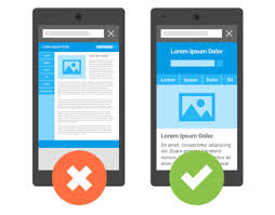
The design of the website may seem fascinating, but chances are that it might not satisfy the visitor’s desire if the required content is neither visible nor easy to navigate. The layout should be clean and not complex so that the viewer’s eyes can easily see the main content and message. Make the page short to prevent much scrolling.
Use of graphics
Don’t put many images on your homepage, too much text, banners, or slideshows that are a nuisance and irritating (reduce visual noise) instead use minimal high-quality graphics. One large image may be enough as compared to many small images. Try to use original images that will give your visitors confidence in your business and what your website has to offer.
Good combination of colors with the background.
The colors should blend together and have a good mix-match (don’t overuse colors). The colors should not steal the focus of images and texts used and not seem like a rainbow.
The main heading of your homepage on your website
The heading should state what you do, be visible, and short for faster reading. The main heading should be bigger and not the same size as all the other headings. Never make the mistake of not having a heading and going straight to a paragraph (it will leave the visitor stranded)
Call-to-action buttons (CTAs) – Get them to do something
These are buttons intended to take one to another page, to complete a certain action, view something on the website, or to get a certain service. A higher percentage of people prefer clicking on such. CTAs should be strategically-placed, have four or fewer words, clear, short, and eye-catching for the intended purpose. Some CTA examples include Call us, Register with us, Get a quote, See our gallery, Buy now, Explore our resort, Pricing, Download and Get in touch
Content matters
When a visitor visits a site, he/she wants to know what the website is about from the first glimpse. The content should give an overview in brief sentences and answer the question; Who am I? What do I offer? What can the visitor engage in? The content should be straightforward and up to date – Don’t be too wordy as it can lead to visitors getting irritated and bored. Not only tell people what you do but also what makes you stand out.
Order of information
Prioritize the content that needs to be seen first and the one that is less important. The hierarchy of importance can be done by:
- Placing high priority information at the top of the page and the other less priority information further down the page
- The body section should show equal priority by using matching heading size and color and matching font size and color in the paragraphs.
- Related content should be placed together in the same boxes.
Communicating to the audience
The homepage should communicate with the audience and be persuasive enough to make them stay on that page and not look elsewhere. The animations, slide shows used, pop-ups, advertisements, and flashy content should not interfere with the visitor’s focus and get annoyed; unnecessary items should be minimal. Using the “Welcome to our page” phrase is not important.
The website design should be according to the intended people; if it’s a forum for discussion, an online library, online, market, news site, magazine site, school website, or any other function. The website should focus on the age group characteristics and needs of the audience for effective communication.
In conclusion: A good overall design
Mobile devices, tablets, laptops, and desktops are being used more often nowadays than they were decades ago.
- The website should be responsive to ensure that it fits well on all devices and does not leave people in distress while looking at smaller or larger devices.
- The website homepage should be fast to load.
- A good combination of colors, easy-to-read fonts, good font size, non-exaggerated graphics, CTAs, not beating around the bush, and good content will make the homepage compelling enough to make visitors want to stay on your website.
- Have white space, easy-to-read content, and clear headings and subheadings?
- Place links in strategic positions.
Trizah provides writing assistance (blog writing, web content writing, e-book writing, technical & documentation writing, ghost writing, copy writing & other writing forms), coaching, web development, market research, product research, app testing, and virtual assistant services.
Her educational background in writing, website design, and community development has given her a broad base from which to approach many topics. She has also worked independently on Upwork. She also enjoys embracing innovations, art and new designs 🙂 Hire Trizah for your online freelance services today!
X (Formerly Twitter)||Linkedin||Medium||Instagram
My blogposts can be found here.
Discover more from Intela Designs
Subscribe to get the latest posts sent to your email.
No responses yet